Piketty's incredibly weak response to the Financial Times finding of errors, Piketty doesn't directly address any of the problems
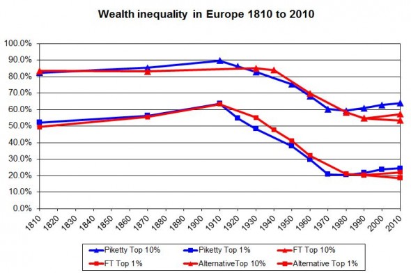
On the corrected European data not showing an increase inequality since 1970, the problems were data not matching the sources that he claimed he obtained the data from, observations being used that don't exist in the sources he cites, and him linking series that are incompatible. His response is:
I certainly agree that available data sources on wealth are much less systematic than for income. . . .First note that he doesn't directly respond to any of the critiques. He comes closest when he says that "one needs to make a number of adjustments," but a more helpful response from him would have been to specifically give one single example. His response clearly doesn't even try to explain data that isn't available in the sources he cites nor is this really a justification for why he would link inconsistent data series.
As I make clear in the book, in the on-line appendix, and in the many technical papers I have published on this topic, one needs to make a number of adjustments to the raw data sources so as to make them more homogenous over time and across countries. I have tried in the context of this book to make the most justified choices and arbitrages about data sources and adjustments. I have no doubt that my historical data series can be improved and will be improved in the future (this is why I put everything on line). . . .
For example, take Giles statement that: "Here’s a list of constructed data, where there appears to be no source or where the source is not described either accurately or fully." A response on the unexplained data would have been something like: if Chris Giles had looked at Appendix B in XXX, he would have clearly seen the source of the data for years XX and XX.
An explanation for the adjustments would have read something like this: while the data in the original source XX doesn't show an increase in inequality, the reason that my series added 2 percentage points to the share of wealth held by the top 1 percent in the United States in 1970 is largely due to my adjusting for YY and ZZ that were not accounted for in the original data source. Clearly, YY has to be done because of AAA.
I would really appreciate if someone could point to one place where Piketty's letter actually addresses Giles' points.
As to the US data, again Piketty doesn't explain why he would arbitrarily add on percentages to the US data.
Finally he then says that all this data is really besides the point because it leaves out certain information, which if we had it, would surely show that he is correct ("Finally, let me say that my estimates on wealth concentration do not fully take into account offshore wealth, and are likely to err on the low side.").
Even Piketty's defenders, such as Neil Irwin at the New York Times, have had to concede that Piketty isn't really responding to the points raised.
He did not specifically address the accusations of data-entry errors or give detailed responses to some of Mr. Giles’s criticisms about questionable assumptions that underlie Mr. Piketty’s broader work. . . .Instead, the defense is one of tone rather than substance.
But in his e-mail to me, he wrote with an almost jovial tone: “Every wealth ranking in the world shows that the top is rising faster than average wealth,” adding, “If the FT comes with a wealth ranking showing a different conclusion, they should publish it!” . . .Not only is this besides the point, it is also clearly wrong. As Giles notes:
In constructing his long-run series (in blue), Prof. Piketty migrates from the Kopczuk-Saez data to that of Wolff (1994, 2010) and Kennickel (2009), even though these are measured on a very different basis. The result is that his line does not have the fall in inequality seen by Kopczuk-Saez but instead shows a rise.
Looking at the two papers by Wolff, which provide estimates from 1960 to 2010, the top 1 per cent wealth share appears to be essentially flat, going from 33.4 per cent of total wealth in 1960 to 34.6 per cent in 2010. Wolff’s papers describe a modest increase in inequality, significantly gentler than Piketty’s graph shows. . . .Paul Krugman also takes Piketty's approach to defense and doesn't directly address Giles point that different series can show different results for the US. A proper response from Krugman would have been to point to why one measure is better than another. Krugman completely ignores the papers by Kopczuk-Saez and Wolff directly cited by Giles above.
There are two other points to make:
1) The changes in inequality that Piketty is focusing on are small. I don't think that inequality is bad -- people are getting paid what others think that they are worth. But compared to historical values, the recent changes, even if Piketty was right, are small.
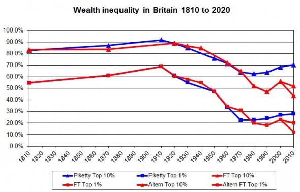
2) Despite people claiming that Giles points aren't that important, I think that anyone who looks at the graphs for the UK or the top 1 percent in the US will see that they make a big difference, though the top 1 percent of the US was already relatively flat.


For Europe as a whole, the very small increases in inequality changes to becoming basically flat.

Labels: Fraud, Piketty, wealthtransfers


0 Comments:
Post a Comment
<< Home